Okay, real talk: I used to think fonts and colors were just… design fluff.
Like, “Pick something that looks nice and move on,” right? But when I finally dug into CRO (conversion rate optimization), I realized I’d been seriously underestimating the power of these little design choices.
The right font and color combo won’t just make your store look clean—it can increase trust, reduce bounce rate, and drive more sales. Yep, for real.
Here’s what I’ve learned the hard way about picking fonts and colors that actually convert on e-commerce sites.
1. Fonts: Keep It Clean, Keep It Clear
You know that feeling when you land on a site and the text is either too fancy or way too tiny? Instant back button. I used to use this gorgeous script font for my product names because it “felt luxurious.” My bounce rate shot up like a firework.
Here are the three fonts I now swear by for e-commerce:
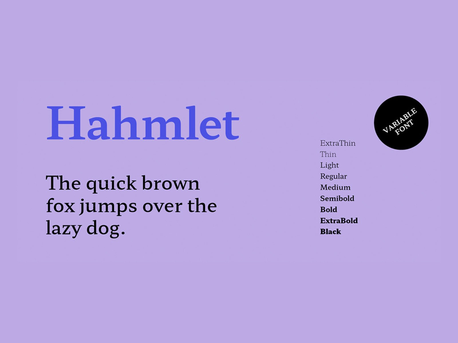
1.1 Inter
This one’s a go-to for modern brands. It’s open-source (free!), super legible, and works across devices. I use it for body copy and product descriptions. Clean, no drama.
1.2 Montserrat
Great for headings. It has a slightly geometric feel but isn’t too stiff. Gives off a cool, modern vibe without screaming “I’m trying too hard.”
1.3 Lato
A little softer and more human-feeling than Inter, but still professional. Perfect if your brand leans more lifestyle or wellness. I’ve seen it work really well for skincare and clothing stores.
Quick tip: Don’t mix too many fonts. One for headings, one for body text. That’s it. Otherwise, it looks like a MySpace page from 2006.
If you’re designing from scratch, check out choosing the best store theme for your brand in 2025 for tips that go hand-in-hand with smart typography.
2. Color Psychology Is Real (And It Matters)
I once built an entire homepage around a muted gray-and-teal palette because I thought it looked “elevated.” My sales? Flatlined. Why? Teal doesn’t exactly scream “BUY NOW.”
Colors trigger emotions—whether we realize it or not. Here are three combos I’ve seen convert across different industries:
2.1 Blue + White + Black
This is the classic for trust. Think tech, finance, electronics. Blue evokes reliability and calm. Great for stores that sell things people want to research before buying.
2.2 Red + White + Gray
Red = urgency. This combo is killer for fast-moving products—think flash sales, gadgets, or anything with limited-time deals. I use this for CTA buttons a lot.
2.3 Beige + Forest Green + Cream
This one’s magic for wellness, home goods, and eco-friendly brands. Feels calming, earthy, and genuine. I helped a friend redesign her handmade soap store with this palette—her sales doubled within two months.
Pro tip: Use contrast wisely. Your CTA buttons should pop, not blend in. I once changed a “Shop Now” button from gray to orange and saw a 14% jump in click-throughs. No joke.
Want more ways to visually connect with customers? Try creating a store banner that boosts engagement using your chosen color palette and type hierarchy.
3. Mobile-Friendly First, Always
If your fonts and colors look gorgeous on desktop but turn into a mess on mobile, you’re leaving money on the table. Over 70% of e-commerce traffic is mobile. I learned this the hard way when my checkout page was barely readable on an iPhone 8. Fixing the font size alone reduced cart abandonment by 11%.
I now test every store design on mobile before launching. I use Figma or even just pull it up on my phone during preview mode. Fonts need to be readable without zooming in. Buttons need to stand out and be thumb-friendly.
This ties directly into mobile optimization for your storefront—a must-read if you want your designs to actually work where people shop most.
Conclusion
Honestly? Nailing your fonts and colors might not seem like a big deal at first. But when you treat them like strategic tools instead of just “design stuff,” that’s when the conversion magic happens.
People don’t always notice good design—but they feel it. And when your store feels trustworthy, clear, and easy to shop, that’s when they click “Add to Cart.”


