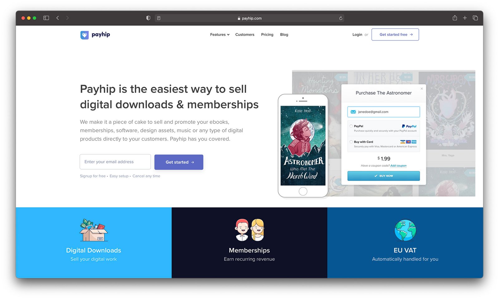
When I first launched my Payhip store, I was just so excited to get my first product up that I totally ignored how the storefront actually looked. Big mistake.
I slapped on a banner, wrote a quick “about me” blurb, picked a color that looked okay-ish—and called it a day. I figured people would buy if the product was good, right? Spoiler: they didn’t. At least, not many.
A few weeks in, I got honest with myself. My storefront looked…meh. Kinda like a rushed school project. It didn’t feel like a brand. And if I wasn’t confident in it, why would anyone else be?
So I took a few days to dig in and really customize my Payhip storefront. Not just “change the font” kind of custom—I’m talking clean layout, branded colors, strategic product positioning, and trust-building tweaks.
And you know what? Sales started trickling in. Then climbing. It wasn’t magic—it was intentional design.
Here’s what worked (and what I wish I did sooner):
1. Start With a Brand Identity
This sounds like fluff, but it matters so much. Before touching the design tab, I asked:
-
What vibe do I want my store to give off?
-
Who’s my ideal buyer?
-
What colors, fonts, and tone fit both?
Once I picked 2 main colors (a soft green and a charcoal gray), one accent, and a Google Font that felt clean and modern, I built everything around that. No more rainbow chaos. Suddenly, my store felt consistent—like a brand I’d actually trust.
Tip: Use coolors.co to lock in a color palette and test how it looks on light and dark backgrounds.
If you’re still stuck at square one, take a moment to read choosing the best store theme for your brand in 2025. It’ll help you set the visual tone before you dive into customization.
2. Polish That Header and Hero Section
That banner at the top? It’s the first impression. I used Canva to design a clean hero image with my brand colors, product mockups, and a short tagline like:
“Digital tools that save time and boost income.”
Then I tweaked the welcome message in the Payhip customization panel to be short, warm, and benefit-driven. Instead of saying “Welcome to my store,” it now says:
“Ready to simplify your workflow? Browse my bestselling templates and get started today.”
It’s a small thing, but it changes the tone from passive to inviting.
Want to go further? Learn how to design a high-converting homepage that actually encourages people to stick around and click “Buy.”
3. Clean Up the Product Layout
Here’s where I messed up originally: I just threw products on the page in whatever order I uploaded them. Not anymore.
Now, I:
-
Group similar products into categories (like “Templates” vs. “Guides”).
-
Use clear, consistent thumbnails—same size, same mockup style.
-
Write short, punchy product titles with benefits (“30-Day Content Calendar – Save Hours Each Week”).
Also, Payhip lets you set a featured product, so I highlight my bestseller at the top. Gives it that extra shine.
4. Add Trust Builders
When you’re selling digital products, trust is everything. I added:
-
A quick “About the Creator” section with a real photo (not a logo!)
-
Testimonials under each product (you can manually add them if needed)
-
Clear refund and support info in the FAQ tab
Even just showing your face somewhere on the page makes a difference. People buy from people, not mystery boxes.
Not sure how to make your reviews stand out? Check out this guide on adding testimonials and reviews to your store—it’s a trust booster that converts.
5. Customize Your URL + Connect Your Domain
This part feels like magic. You can upgrade your Payhip plan and connect a custom domain like shop.yourname.com. Even if you’re not super techy, it’s easy to do with Payhip’s guide and gives your store instant credibility.
No more payhip.com/username123—just a clean, professional-looking site.
Conclusion
The cool thing? You don’t need to be a designer to make your Payhip storefront look amazing. Just take a little time to make sure it reflects you and the value you’re offering. I’ve had buyers tell me they decided to purchase because my site “looked so put-together.” That stuff matters.
Bottom line: If you want to sell more, make your storefront feel like a boutique—not a bargain bin.


