I’ll never forget the day I rage-quit buying a shirt online.
It was one of those “limited drop” kinds of things, the kind where the countdown timer gives you FOMO and you have to act fast. But the checkout process? Ugh. Five screens. Account creation. Address confirmation. Credit card entry. CAPTCHA. I gave up halfway through. They lost the sale, and I lost the shirt.
That was my wake-up call as a store owner. I realized: if I’m bailing on other people’s clunky checkout processes, what makes me think my customers are any different?
The Moment That Changed Everything
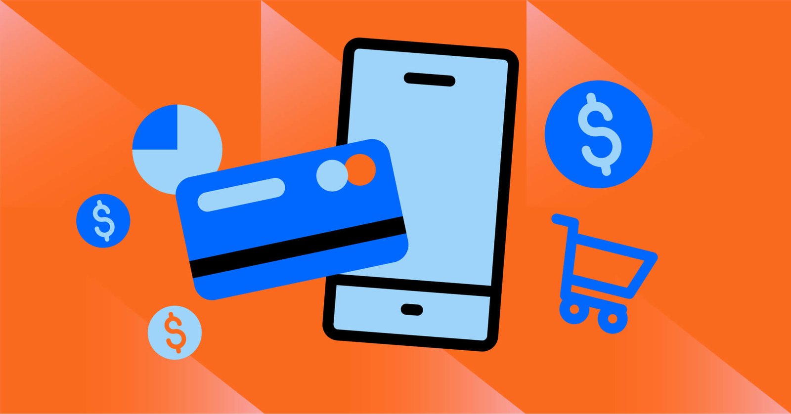
So, I ran a quick test. I enabled one-click checkout on my Shopify store using Shop Pay. Just wanted to see if it made a difference.
And let me tell you, it absolutely did.
In the first week, I saw a 23% increase in completed checkouts. Not traffic. Not clicks. Completed orders. People went from “maybe later” to “bought it in 10 seconds.”
The kicker? Those new sales came mostly from mobile shoppers. You know, the ones who usually bounce the second a site asks them to enter their shipping info on a tiny touchscreen.
Why One-Click Checkout Works? (Especially Now)
Let’s be real — we’re all impatient. And your customers? They’re juggling a dozen tabs, probably shopping while waiting for coffee or pretending to listen on a Zoom call.
Here’s what I’ve learned:
-
Every extra click = friction
Asking someone to enter billing, shipping, AND card info when they’re on the go? That’s how carts get abandoned. One-click checkout removes the excuses. -
It creates a “dopamine loop”
Sounds geeky, but hear me out. When buying is fast, it feels easy — almost impulsive. People don’t overthink it. It’s the same reason Amazon’s “Buy Now” is so addictive. -
It builds trust through convenience
Most one-click platforms like Apple Pay or Google Pay auto-fill the details. That’s comfort food for your customer’s brain — no forms, no passwords, no stress.
If you’re working on optimizing this flow, I highly recommend setting up secure checkout pages so customers feel safe clicking that button.
What Worked for Me? (And What Didn’t)
Okay, full honesty — I messed this up at first. I tried to DIY a one-click checkout button using some shady plugin I found in a forum. Looked awful on mobile and crashed 10% of orders. Oof. Lesson learned.
Eventually, I switched to built-in tools like Shop Pay, PayPal One Touch, and Apple Pay. Easy to install, reliable, and smooth as butter. Here’s what actually helped conversions:
-
Enabling multiple one-click options
Not everyone uses Shop Pay. Some folks live by Google Pay, others are Apple loyalists. I added all three, and my abandoned cart rate dropped like a rock. You can read more on how to offer multiple payment options that meet your audience where they are. -
Making it visible upfront
I used to hide those quick-pay buttons after people filled in info. Big mistake. Now, they show up immediately under the product — and people use them constantly. -
Mobile-first optimization
I stopped thinking of mobile as a bonus. It’s now my main audience. So I designed the checkout flow with thumbs in mind. One click, one swipe — done.
If you’re using Stripe, it integrates well with one-click setups. I’d suggest checking out using Stripe for payment processing to make sure your backend supports it smoothly.
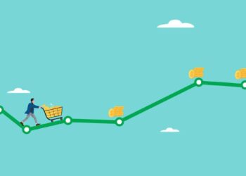
Don’t Overthink It, Just Make It Easy
Here’s what I wish someone told me sooner: People don’t want a shopping experience. They want a fast, smooth transaction and then to move on with their day.
If your checkout process feels like a DMV line, they’re gone.
But if you make it stupid simple — one click and it’s done? They’ll not only buy — they’ll come back.
So go check your store right now. Test it on your phone. How many clicks does it take to buy something? If it’s more than one or two… you’ve got work to do. But the fix? It’s easier than you think.
And trust me, that extra 10 minutes you spend enabling one-click checkout? It can pay you back for months.


