I’ll never forget the first time someone messaged me and said, “Hey, I couldn’t find what I was looking for on your site, so I gave up.”
Ouch. That one stung. Not because they were mean about it—but because they were right.
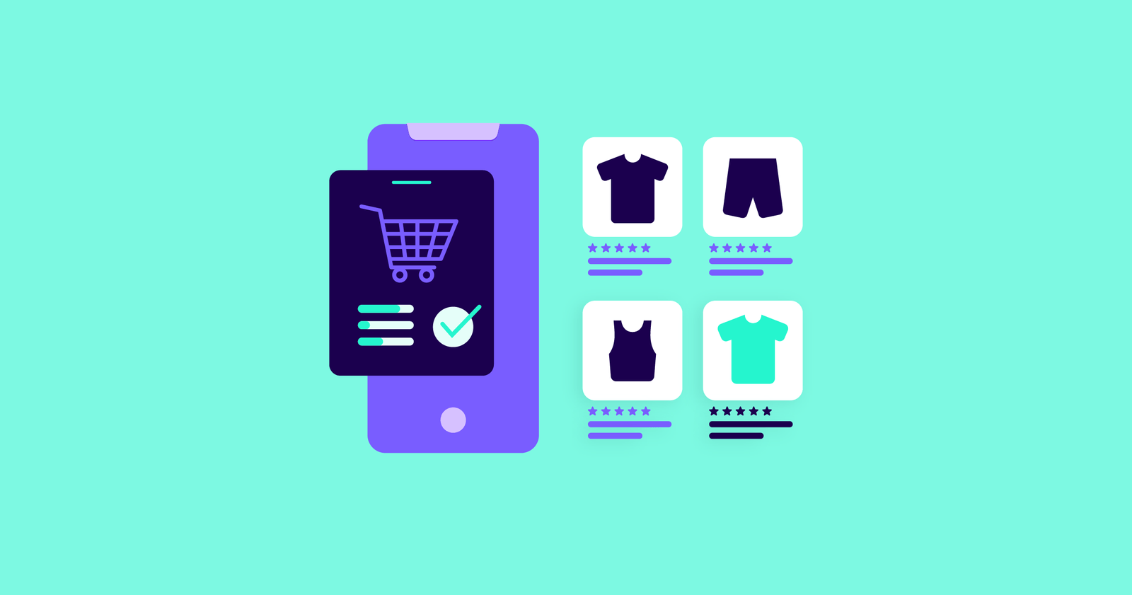
My online store looked great. Slick homepage, beautiful product images, colors that popped. But the navigation? A total mess. Dropdowns on dropdowns. Categories that made sense to me but not to anyone else. And don’t get me started on mobile—complete disaster.
Fixing that one piece—just the navigation—cut my bounce rate in half and tripled my average session duration. No joke.
Keep It Stupid Simple (K.I.S.S.)
Here’s the thing. When someone lands on your store, they’re usually not trying to explore like it’s a museum. They’re on a mission. If they have to click more than twice to find a product, they’ll peace out and go to someone else’s site.
I used to have 10 categories in my top nav. Ten. Like, who did I think I was—Amazon?
Now I stick to 4 or 5 max. Something like:
-
Shop All
-
Categories (with logical subcategories)
-
About
-
Contact
-
FAQ or Support
That’s it. Clean, simple, no decision fatigue.
If you’re unsure where to begin, start by customizing your Payhip storefront to make it look professional and sell more. Simplifying your layout is a huge part of the battle.
Use Words Your Customers Actually Use
I had this cute idea to label one of my sections “Collections of Comfort.” Sounds cozy, right?
Yeah… nobody clicked it.
Turns out, people were searching for “Loungewear Sets” and “Comfy Clothes.” Not “collections” and definitely not “comfort.” That’s when I started pulling terms straight from search bar queries and customer messages.
Your navigation isn’t the place to be clever. Be clear. Be boring, even. “Workout Gear” beats “Move Mode Essentials” every day of the week.
You can get better insights by A/B testing store elements for better sales. Sometimes a single label change can lift conversions more than a whole design overhaul.
Make Mobile a Priority, Not an Afterthought
95% of my traffic comes from mobile. But for the longest time, my mobile menu was like playing Jenga blindfolded. Hamburger icon → Slide-out menu → Nested dropdowns → Whoops, tapped the wrong one… back up, try again.
No wonder conversions sucked.
Now, I do this:
-
Prioritize the most important links at the top
-
Use collapsible menus for categories, not layers of nested menus
-
Make the “Search” function big and obvious
Also, make sure buttons are thumb-friendly. If people have to zoom in to tap, they’ll just rage-quit.
If you’re not optimizing for mobile, you’re losing half your audience. Here’s how to get started with mobile optimization for your storefront the right way.
Highlight Your Search Bar Like It’s a Feature
People who use the search bar are usually ready to buy. That’s hot traffic. But if they can’t find the search bar—or it doesn’t work well—you’re losing money.
I used to bury mine in the corner of the header with a tiny magnifying glass icon. When I added a full-width search bar at the top and included autocomplete suggestions, I saw a 40% increase in purchases from search users.
If you’re on Shopify, apps like Searchanise or Doofinder are clutch. Just make sure your search supports typos, filters, and synonyms.
Breadcrumbs & Filters Are Lifesavers
Okay, real talk—breadcrumbs are underrated. People want to know where they are on your site and how to go back one level without starting over. Especially in big catalogs.
And filters? Game-changer.
Before I added filters by size, color, and price, people were scrolling through everything, getting frustrated, and leaving. Now, they can narrow down in seconds. It’s smooth. Feels like shopping on a real site, not digging through someone’s closet.
Pro tip: Make sure filters reset easily. That UX mistake alone cost me more sales than I care to admit.
Track What’s Working, Then Improve It
I install Hotjar or Microsoft Clarity on every store I run. Watching those session recordings is wild. You see people rage-clicking menus, missing links, scrolling back up like, “Where the heck am I?”
That’s how I found out people thought my category names were clickable—but they weren’t. Fixed that and saw a spike in time-on-site.
Also: check your search analytics. What are people typing that’s leading to zero results? That’s free gold.
To Wrap It Up
Your navigation is like the GPS of your online store. If it’s clunky, unclear, or slow, people will bail—no matter how great your products are.
Simplify it. Speak your customers’ language. Test it often. And remember: if your mom can’t find the “add to cart” button in 10 seconds, start over.
Better UX means happier customers and that means more sales. Don’t sleep on this part.


