
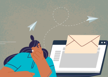
Have you ever opened an email that was so visually appealing you couldn’t help but keep reading?
That’s the power of great email design! I once worked with a small nonprofit that struggled with low engagement rates. Their emails were text-heavy and visually dull, so we revamped their design with compelling visuals, a clean layout, and strong CTAs. The result? A 50% increase in click-through rates and a noticeable boost in donations. That’s when I realized that email design isn’t just about looking good—it’s about capturing attention and driving action.

Key Takeaway: Effective email campaign design combines visual appeal with functionality, ensuring your message grabs attention, engages readers, and motivates them to take action.
1 Why Email Campaign Design Matters?
Email design is more than just aesthetics—it’s the foundation of a successful campaign. Here’s why it’s critical:
- First Impressions Count: Your design determines whether recipients will engage or hit “delete.”
- Improved Readability: A well-structured layout ensures your message is easy to digest.
- Boosted Engagement: Eye-catching visuals and clear CTAs encourage clicks and conversions.
- Stronger Branding: Consistent design reinforces your brand identity and builds trust.
Think of email design as the packaging for your message—if it’s appealing, recipients are more likely to open and engage.
2 Key Elements of Effective Email Campaign Design
To create an impactful email, focus on these essential elements:
1. Compelling Subject Line
The design starts with the subject line—it’s your first opportunity to grab attention.
- Keep it short and specific (under 50 characters).
- Use action words or personalization to make it stand out.
- Example: “Exclusive Deal: 20% Off Just for You!”
2. Clean Layout
A clutter-free design improves readability and user experience.
- Use a single-column layout for simplicity.
- Break up text with headings, bullet points, and white space.
- Ensure important elements (e.g., CTAs) are above the fold.
3. Eye-Catching Visuals
Images, graphics, and videos can enhance your message and grab attention.
- Use high-quality visuals relevant to your content.
- Optimize image sizes for faster loading.
- Add alt text for accessibility.
4. Clear Call-to-Action (CTA)
Your CTA is the most important part of the email. Make it impossible to miss.
- Use action-oriented language like “Shop Now” or “Sign Up Today.”
- Place the CTA button prominently and use contrasting colors to make it pop.
5. Consistent Branding
Reinforce your brand identity with a cohesive design.
- Include your logo and brand colors.
- Use consistent fonts and tone across all emails.
6. Responsive Design
With over 60% of emails opened on mobile devices, your design must be mobile-friendly.
- Use a responsive template that adapts to different screen sizes.
- Ensure buttons and links are easy to tap on smaller screens.
3 Tools for Designing Stunning Email Campaigns
You don’t have to be a designer to create beautiful emails. Here are some tools that make it easy:
- Canva: Great for creating custom graphics and banners.
- Mailchimp: Offers drag-and-drop templates for visually appealing emails.
- HubSpot: Provides professional-grade templates and analytics.
- BEE Free: An intuitive editor with responsive design options.
- Adobe XD or Figma: Ideal for advanced custom designs.
When I worked with the nonprofit, we used Canva for banners and Mailchimp for the layout. The combination was both effective and easy to manage.
4 Best Practices for Email Campaign Design
To ensure your email design delivers results, follow these best practices:
1. Prioritize Readability
Use legible fonts (12–14px for body text) and a clear color contrast between text and background.
2. Limit Colors and Fonts
Stick to 2–3 colors and 1–2 fonts to maintain a cohesive look.
3. Use Visual Hierarchy
Guide the reader’s eye with larger headlines, bold CTAs, and strategically placed images.
4. Optimize for Speed
Compress images and avoid heavy files to ensure quick loading times.
5. Test Before Sending
Preview your email on different devices and platforms to catch design issues.
5 Examples of Effective Email Campaign Designs
1. E-Commerce Campaign
- Subject Line: “Your Wishlist Awaits—Shop Now and Save!”
- Design:
- Banner showcasing popular products.
- Simple layout with product images and prices.
- CTA: “Shop the Sale” button in bold.
2. Nonprofit Campaign
- Subject Line: “See the Impact You’ve Made!”
- Design:
- Hero image of beneficiaries.
- Text highlighting key achievements.
- CTA: “Donate Again Today.”
3. B2B Campaign
- Subject Line: “Unlock Your Free Trial Today!”
- Design:
- Clean, professional layout.
- Graphics illustrating product benefits.
- CTA: “Start Your Free Trial.”
6 How to Measure the Success of Your Email Design?
After sending your email, track these metrics to evaluate its performance:
- Open Rate: Indicates how compelling your subject line is.
- Click-Through Rate: Measures engagement with your content and CTAs.
- Conversion Rate: Tracks how many recipients completed the desired action.
- Bounce Rate: Shows if your email is reaching the inbox.
Use insights from these metrics to tweak and improve your design over time.
7 Conclusion
Mastering the art of email campaign design is about more than making emails look good—it’s about creating an experience that engages and converts. From clean layouts and stunning visuals to clear CTAs and responsive designs, every detail matters.
Start by experimenting with simple layouts and bold CTAs. Test different designs, track your results, and refine your approach based on what works best for your audience.
Remember, a well-designed email isn’t just another message in the inbox—it’s your chance to make an impact. Design with intention, and your campaigns will soar!


